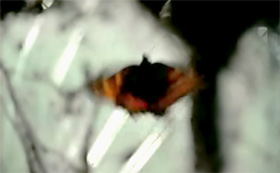
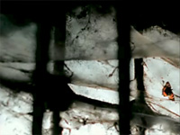
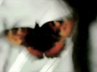
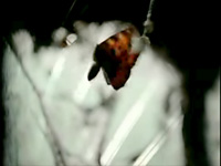
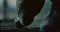
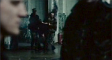
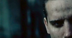
Introduction The two spots were made at about the same time (2000-2001) and deal with different forms of state terrorism. Butterfly evokes the subjugation of Tibetans by a foreign occupying power - namely China, while Firing Squad depicts the fate of artists living in countries ruled by military dictatorships. However the focus of this study will not be on the forms of terror represented, but rather on representational strategies employed in these ads, which differ considerably in many respects. In comparing these two ads, I hope to describe as concretely as possible some of the major variables in play in their storytelling. A shot-by-shot breakdown of Butterfly
An interview with Arran de Moubray on Butterfly I have a friend who was doing a lot of work with the Tibet Society in his free time, and happened to talk to him about wanting to film something for them, as I had watched a documentary on the plight of the Tibetans a few days previously. He came back and said that that'd be great, but it would have to be either sponsored, or shot for nothing, as there were no funds. But they could supply some free air time in the cinemas. He also said a lot of people wanted to do things, but never got round to it because of the time involved, and the financial constraints. I was determined not to be one of these people, so I tried to think what I could do that was simple but effective. That very afternoon I had to on a location recce [recon], for a Nike commercial, in a very dark and atmospheric basement. While looking around, I saw several beautiful and fragile butterflies hibernating, waiting for the sun. And I thought this was a brilliant metaphor for the Tibetans - a beautiful culture waiting for its time to shine again. Then I noticed the spiders' webs in the windows - if I put a butterfly in there, and film it struggling to get out, I hardly have to say anything... This metaphoric approach to telling the story is rather unusual in public service spots. Offhand, I can't think of another spot that works quite this way. Did you think of this as a somewhat bold move in designing the spot? Not really. To be honest I hate the pigeonholing in commercials and public service spots. There are maybe only two or three different forms of each that everyone copies, with a slight change to try and make it different... I didn't ever want to use crying children and crumbling icons - it's not new. I wanted to create something that would make people cry and want to help. I also wanted people not to realize what they were watching at first - to seduce them, rather than have them switch off - 'not another charity'!... The irony about using a butterfly is that many people (and this is why using an animal works) said to me "but what about the poor butterfly?". I can't tell you how may times I had to say to these people " what about the million people?". They missed the point - at first - but maybe they would remember something later... The many fragments of text remain on the screen for relatively short periods. And the script you chose to write them in is not always easy to read very quickly. I wondered whether you deliberately chose to do the opposite of imposing texts on the viewer - and instead, did the visual equivalent of speaking quickly and in a low voice, so that the viewer has to listen hard to catch the words. Or were there entirely different considerations in play? No, absolutely correct. I used the text for two reasons: firstly to make it difficult for people to read, so that they had to really concentrate - almost 'discovering' the facts themselves, rather than being preached to. For this reason I kept a few words on for longer, so that if nothing else, they could associate the images and sounds with key words, and then think about it afterwards. The second reason was that I wanted to create (and this may be a little bit pretentious - I don't know!) typography that was simple and distressed - not only mirroring the subject matter, but also to make people feel a little awkward about the whole thing. If a spot is glossy and easy to read, people don't feel it... Is there anything else you can tell me about your work on the spot? Two days after seeing the butterflies I was shooting the Nike commercial. In the lunch break, I took my director of photography over to the spiders' webs and asked him to shoot as soon as I placed the butterfly in the web. He didn't have to light it, and shot it beautifully. We burned off one roll of 35mm film and that was that. The next day I got into the edit suite and cut it together. It was immediately impactful. Then I got a student at the Royal College of Art to do the typo for me, and got a favor from the music designers to create a simple score (I wanted it to be just frantic fluttering sounds - they introduced the haunting bells, which I think work brilliantly). Did you get any feedback from the Tibet Society about the spot? When I showed it to Tibet Society, they loved it... (in fact so much, that one of them worked for Amnesty International, and tried to get me to give it to them for a world wide ident!). One of the most important qualities of the spot is that it is visually stunning-- immensely pleasurable in a purely aesthetic sense (interplay of colors and forms). I have noticed this same quality is some of your other work. Could I ask you to comment on this aspect of the Tibet Society spot? I wanted to do both the butterfly and the culture of Tibet justice! I also believe people will take things more seriously if they are aesthetically pleasing and look 'professional'. This spot was for cinema, and you want a great impact before a film that looks great... and finally, I love to look at painters like Velasquez and Tintoretto - there's as much going on in the darkness as in the light... 22 December 2004 A shot-by-shot breakdown of Firing Squad
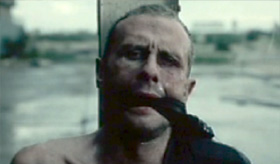
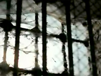
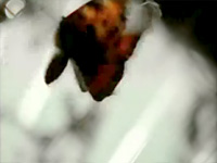
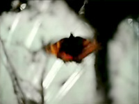
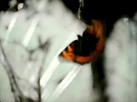
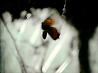
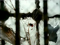
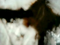
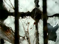
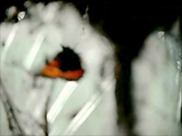
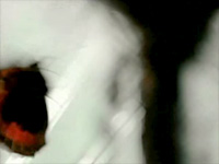
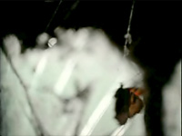
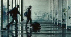
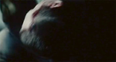
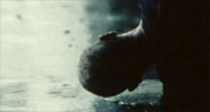
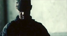
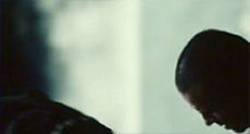
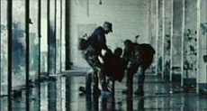
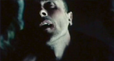
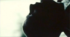
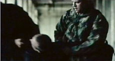
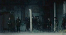
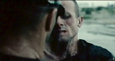
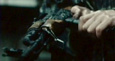
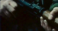
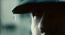
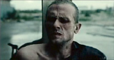
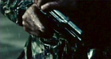
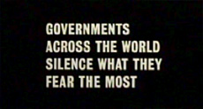
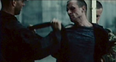
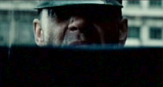
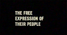
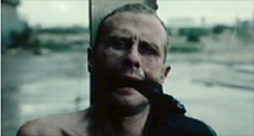
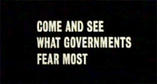
Some properties of the two spots 1. METAPHOR VS REALISM The butterfly struggling for its freedom acquires a metaphoric status in the viewer's eyes at about a quarter of the way into the spot, once the first title establishes the theme of imprisonment because of one's beliefs. But it is not until the third title appears on screen, nearly half way into the spot, that the captivity in question is identified more specifically, and from that moment on, the butterfly becomes a metaphor for the people of Tibet. Likewise, the entrapping cobwebs, grids and enclosures appearing in the spot come to symbolize from then on the Chinese occupation of Tibet. The butterfly and web-ridden cellar constitute what some theorists of metaphor would call the "source domain," while the things they represent - the people of Tibet and the Chinese occupation - would be designated as the metaphor's "target domain." [1] The main opposition within this particular source domain - a freedom-seeking butterfly vs. entrapping webs and spaces - is enriched by a number of corresponding polarities, including: bright, warm colors vs. cold, dark shades; beauty vs. ugliness; delicacy vs. bulk; movement vs. stillness; life vs. death. And these attributes are carried over to the respective entities in the target domain as well, so that the Tibetan people are not only represented by the butterfly as prisoner but are also infused with such traits as its colorful, delicate beauty; and the Chinese occupation is correspondingly identified with the grim and chilling qualities of the web-infested cellar. While the live-action shots in Butterfly are metaphoric in the ways described above, those in Firing Squad embody a realist esthetic, to such a degree that a military advisor (Richard Smedley) was engaged in its production. Here, there is no distance between a source domain and target domain, though we are dependent on the spot's three titles to know that the man brutally beaten before our eyes and prepared for immediate execution, stands for all artists "governments across the world" attempt to silence. The images of his mistreatment and positioning for the firing squad require no decoding of the kind in play in Butterfly. There is however one symbolic twist embedded in Firing Squad's realism, in that the cloth raised to the prisoner's face in shots 23 and 24 turns out in Shot 26 to be to be gag, rather than the blindfold we had expected. This final image of the victim connects with the reasons for his persecution in the first place: the government's fear of what he might say. As the creative director and co-writer of the spot, Frazier Jelleyman, describes the central character:
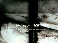
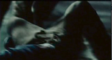
Furthermore, the acting in the spot, and most particularly the face and body-language of the man playing the victim (Stephen Scott), carries much of the storytelling in this PSA. The director, Caswell Coggins, has described the casting of that role as follows:
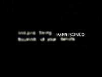
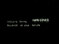
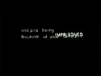
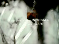
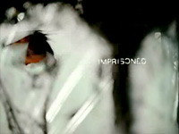
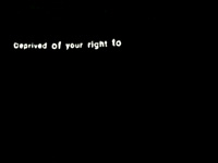
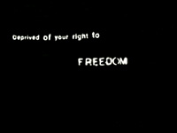
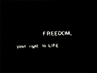
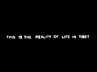
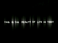
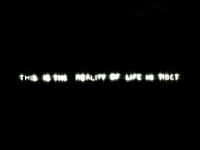
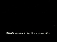
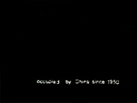
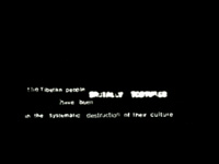
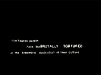
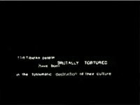
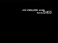
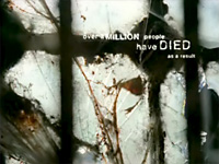
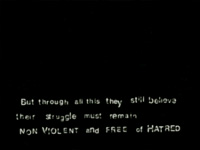
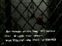
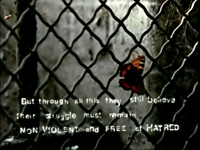
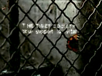
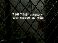
Both esthetics - Butterfly's metaphoric and Firing Squad's realistic images - bring tremendous power to these spots, each it in its own highly economical way, enabling each spot to make its point with great effectiveness in the interplay of live-action with titles. 2. LINEAR VS. NON-LINEAR STORYTELLING The order in which the live-action shots are situated in Butterfly was determined more on the basis of visual esthetics than with respect to specifically narrative concerns. In fact, the live-action component of the spot has no real beginning, middle or end in the traditional sense. It is rather a montage of often stunning images that illuminate the same situation in a number of ways and in a sequence that is not decisive for our understanding of the story being told. In this spot, it is the titles that move the story forward, carrying us from beginning, to middle and to end, while the live-action images are free of any linear logic of their own. In Firing Squad, on the other hand, it would be difficult to change the overall order of the live-action shots without disrupting the story, which begins when the prisoner is thrown to the ground and repeatedly kicked, then dragged out to the execution post, and finally bound and gagged in preparation for being shot. Here it is the live-action that drives the story forward, while the titles fulfill a more explanatory function, ultimately connecting the story to the "Artists in Exile" event promoted in the spot. 3. VISUAL AND AURAL RELATIONS OF TITLES TO LIVE-ACTION In Firing Squad, there is no overlapping of titles and live-action, either visually or aurally. When a title appears, the soundtrack suddenly goes silent and there are no dissolves in which the footage on screen even fleetingly contains both a title and any live-action. These two building blocks of the spot are kept entirely separate, each given its own moments in the film, so that live-action and titles alternately possess the exclusive attention of the viewer, without ever being blended. In Butterfly, the relation of titles to live-action is more fluid, with the same continuous soundtrack underpinning both, and with titles repeatedly superimposed over live-action images. This occurs, for example, at the start of Shot 9, where the full text of Title 1 momentarily persists over an image of the butterfly dangling from a web: "imagine being IMPRISONED because of your beliefs." A moment later, only the word "IMPRISONED" remains superimposed over the image, and just before the shot ends, only the image of the butterfly remains. Other momentary superimpositions of text over image occur in Shots 10, 16, 17 and 19. And when Shot 22 is faded in from black, Title 7 persists on screen ("But through all this they still believe their struggle must remain NON-VIOLENT and FREE OF HATRED"), over the metal grid and locked window blocking the butterfly's path to freedom. Then as the image persists, Title 7 is faded out and the spot's end title is faded in ("THE TIBET SOCIETY / Your support is vital") and remains on screen as the live-action image is faded out. 4. TYPOGRAPHY AND TITLE DURATION The titles in Firing Squad are like front-page headlines, printed in bold white capital letters over a black background and easily readable. The viewer is given ample time to take in each of the spot's four titles (Shots 22, 25, 27 and 28) without feeling rushed and the titles are clearly designed to deliver their full payload in a single viewing. The titles in Butterfly are of another nature entirely. Here the white print over black background is small, flickering, sometimes even mobile (the word "IMPRISONED" for example changes position several times in Title 1), and sometimes momentarily overexposed or blurred (as in Title 2). Furthermore, these exceptionally unstable titles are often kept on screen for too short a time for the viewer to catch all the words. As the reader may recall, Arran de Moubray deliberately made the titles
Concluding note The following table summarizes most of the points made above:
Different as they are in many of their representational strategies, Butterfly and Firing Squad also have some important traits in common. In both spots, for example, the editing rhythm is unusually rapid, with an average shot length of only 2 and 2.3 seconds respectively (though the figure for Butterfly depends of course on how the often overlapping titles are counted). Furthermore, each spot has a clearly defined aggressor/victim polarity at its core, emphasizing in its portrayal of those suffering human rights abuses: 1) a denial of their right to life by an oppressive government; and 2) their physical harmlessness - the Tibetans' struggle remaining "non-violent" and "free of hatred" (Title 7) and metaphorically embodied by a butterfly, while the crime committed by the firing squad's prisoner had consisted of speaking his mind perhaps through the painting of a canvas. (It is true, however, that the victim in Firing Squad is feared by his government, while no such political threat is evoked in Butterfly.) And while the cold-blooded practices of the aggressors are by no means downplayed in either ad, the focus of each of the spots is on supporting the victim, not on stigmatizing an enemy; though once again, in the case of Firing Squad, the viewer is invited to consider the disarmingly modest gesture of support he or she is asked to perform - simply seeing the works of Artists in Exile - as an act of defiance. | |||||||||||||||||||||||||||||||||||||||||||||||||||||||||||||||||||||||||||||||||||||||||||||||||||||||||||||||||||||||||||||||||||||
| |||||||||||||||||||||||||||||||||||||||||||||||||||||||||||||||||||||||||||||||||||||||||||||||||||||||||||||||||||||||||||||||||||||