|
The concept of symmetry sounds simple and familiar, yet symmetry is far more complex and difficult to apply in practice than one might think. The visual power of symmetry is so great that filmmakers often avoid or are advised against using symmetrical picture compositions. And this is not so odd, for if symmetry is used randomly and thoughtlessly, one runs the risk of creating visual disturbances in the narrative of the film. On the other hand, the filmmakers who master the art of symmetry wield a powerful visual aid capable of communicating complex meanings that cannot otherwise be conveyed visually. For those interested in picture composition in film, either as filmmakers or analysts, here is an opportunity for taking a bite of the forbidden fruit of picture composition in film. DEFINITIONS OF SYMMETRY Translatory Symmetry
The composition of the picture from Tombstone (George Cosmatos, 1993), showing three sheriffs, is based on the principle of staggering an object (fig. 1). By means of non-linear displacement, as well as of overlapping the objects, the objects in this example of translatory symmetry give the impression of a moving organism rather than appearing static. However, the expressive powers of translatory symmetry are not as evident as those of other forms of symmetry. Hence, for this reason among others, translatory symmetry does not have the same visual impact. Rotational Symmetry
At one point, depending on the number of objects, this becomes a kind of rotational symmetry where the impression of several isolated objects gradually disappears (fig. 3). As fig. 3 from The Big Lebowski (Joel Cohen, 1998) also shows, rotational symmetry does not conform well to the wide-screen format. The squarer the format of the medium, such as the 3/4 format of television, the better rotational symmetry will be able to develop without having to be trimmed. This is clearly one of the reasons rotational symmetry is rarely used in film. Axial Symmetry (also called Bilateral or Mirror Symmetry) The axial symmetric picture consists of two mirroring parts which start out by counterbalancing each other compositionally, thus often creating compositions that are statically in balance. Yet as a closer look at axial symmetry will show, the concept has various expressive possibilities. The example from Star Wars - Return of the Jedi (Richard Marquand, 1983), showing the Emperor on his throne, demonstrates the manner in which a traditional understanding of axial symmetry can involve a complex mirroring space, transferring it to a person placed in the axis of symmetry (fig. 4).
The wide-screen format of film is well suited to axial symmetry, as it provides ample room for the mirroring parts when the axis is placed vertically in the center of the picture. When it comes to film, axial symmetry is the most interesting and widely used form of symmetry; thus, when mentioned below symmetry refers to axial symmetry. SYMMETRY/ASYMMETRY No symmetries outside of exact science are totally symmetrical, which is of course also true for picture compositions in film. Offhand, this appears to be a problem, and it may well be one, but it can also be a strength: it is often the deviation from ideal symmetry that makes a composition interesting. It adds the possibility for artistic expression to the composition, which is not usually associated with symmetry. A basic observation may be phrased thus:
Filmmakers have the possibility of using different forms of axial symmetry to articulate different visual expressions. In an attempt to locate the border between symmetry and asymmetry, I will now provide a number of examples illustrating borderline or near-borderline cases. In film, one of the most frequent forms of composition, often on the verge of being symmetrical, is a frontal medium close shot of a character. This is a compositional form appearing in almost all films with slight variations - the camera angle may be a little off, the person might be moving asymmetrically, or the background may not be particularly symmetrical, etc. - often leading to the conclusion that the composition is not symmetrical. In order to define such a composition as symmetrical a number of mirroring elements are necessary, either on the person or in the background, as well as a minimum of asymmetrical disturbance.
The picture of Wyatt Earp from Tombstone (1993), fig. 5, is an example of a composition that can only just be defined as symmetrical, even if the person's body is slightly angled towards the spectator and it is only possible to see one arm, for his face is easily seen en face and there are no background elements disturbing his dominance of the picture composition. But the decisive element is his hat, the outline of which is very dominant, and which visually interacts with his mustache. The dominance of the hat in the picture composition is so decisive that if the hat were removed, the composition would become asymmetrical. To demonstrate this claim I have manipulated the picture and attempted to reconstruct the actor's head as it might have looked without his hat (fig. 6). Without the hat I find that the symmetry is weakened so much that the remaining symmetrical elements are not adequate to define the composition as symmetrical. The placement of the symmetry axis in the picture is also significant for the question of whether the composition is symmetrical, as well as for the expression of the composition. I have illustrated this by manipulating the picture yet again (fig. 7). When the mirroring axis is removed from the geometrical center of the picture, the composition changes radically and the picture becomes asymmetrical. This picture already bordered on being asymmetrically composed, yet even for very symmetrical compositions the camera does not have to be moved far before the compositions must be described as asymmetrical. The following example from Star Wars - Return of the Jedi (1983) shows a composition apparently full of symmetrical elements but that must be defined as asymmetrical (fig. 8). The picture shows a pilot in a fighter plane on his way to attack the Empire. The cockpit is symmetrical, as are the pilot and especially his headgear. Yet because the pilot turns his head he upsets the symmetry. All attention is drawn towards the left side of the picture, and the distorted symmetry around the pilot stands out against the cockpit, which is symmetrical in relation to the framing of the picture, but not in relation to the rest of the composition. Hence, there appear to be two axes of symmetry in the same picture, and as they are not coordinated, and the most significant one is distorted, the totality of the picture lacks symmetry. If the pilot had been facing straight into the camera, this composition would have been very symmetrical. Instead the composition is out of balance, and this illustrates how little it takes to upset or disturb a symmetrical situation. Is this pilot capable of being the wedge of the attack that he is supposed to be? The picture composition suggests something else, thus heightening the tension.
An example from The Deer Hunter (Michael Cimino, 1978) shows another composition at the borderline between symmetry and asymmetry (fig. 9). There is obviously a smaller part of the picture, around the table, which is symmetrically composed of several elements - the two duelists with headbands, the arms of the referee, and his placement in the axis of symmetry marked by his tie. The rest of the picture consists of an asymmetrical gray mass, uncontrolled by the symmetrical elements. The symmetrical composition simply constitutes too small a part of the picture for us to call it symmetrical. If the symmetrical elements had been placed in the central axis, they would still have controlled only part of the composition, but because the symmetrical elements would then have controlled the most significant area, the center of the picture, the picture could have been described as vaguely symmetrical. Actually, the composition reflects Nicky's situation exactly. In mental chaos after being tortured during his previous imprisonment, the only thing he can deal with is Russian roulette, which creates a kind of structure in his life. In this sense, the composition functions optimally, creating a weak, distorted symmetry in asymmetrical chaos. Even if only details of a composition are symmetrical and the picture thus must be considered asymmetrical, the symmetrical elements can be so strong that they add significantly to the meaning of the picture composition. Yet the main rule must be as follows:
In a qualified discussion on symmetry and asymmetry, it is important not to disparage an asymmetrical composition. In film, the visual expression of the pictures should preferably be in accordance with the action of the film, and this makes asymmetrical compositions the primary component of a film's visual agenda. ADVICE ON THE USE OF SYMMETRY Symmetry is a very obvious form of composition, which of course offers opportunities but at the same time can cause a situation to seem artificial, stilted, and thus shatter the illusion of the fiction. This is possibly the reason that a lot of filmmakers try to avoid symmetry. If this is a concern I think that a sophisticated use of symmetry could circumvent such problems. And whatever the approach, my advice is as follows:
Rather than accentuating insignificant events in the film, it is important to emphasize those that are important at the right time. In addition it is important to remember that like any other filmic device the effect of symmetry is weakened by frequent use. a) Important characters
Less significant characters can appear as mirroring objects; however, if they do not refer to a significant character in the axis of symmetry this should be carefully considered. To place an insignificant character in the axis of symmetry can be disastrous for the spectator's perception of the scene, which is why this is hardly ever done. b) Basic use
In Young Guns II (Geoff Murphy, 1990) the camera moves in close to Pat Garret's face when he decides to betray Billy the Kid. The movement starts asymmetrically, but becomes symmetrical, and the second Pat Garret's face is seen entirely symmetrically the shot dissolves into a shot of Billy; thus the symmetry is also used to show what Pat Garret is thinking and what he has decided to do. Powerful characters
Although this use of symmetry may be tempting to apply often in a film, it is not advisable. Community
This use of symmetry may be narratively expedient, and may be varied by placing an extra person in the axis of symmetry, thus creating an internal power structure between the involved characters. Death
As the simplest form of symmetry can express peace, stability and eternity, it is natural to apply symmetry in these situations. Furthermore, this use has evolved so much that we now often see dying characters in symmetries with diagonal axes. The acceptance or expectation of symmetry in connection with death is so great that it may be described as one of the most developed areas in the creative use of symmetry, as will be illustrated by an example in the next section. c) Advanced use
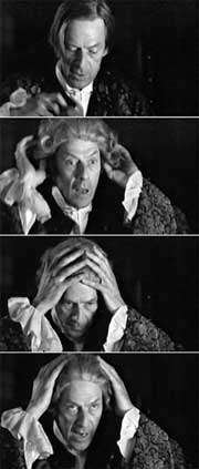
When the civil servant Niels, who doesn't really seem like an official, has to have an important conversation with Andreas, he puts on his wig to indicate his authority. Visually, his putting on the wig creates a number of symmetrical variations in this shot, all of which point to Niels's transformation - from being a kind and natural man in asymmetrical compositions to at least attempting to appear the somber civil servant, tough and rigid of attitude. To be exact, no clear symmetries are used in this shot since the camera angle is not frontal, yet there seems to be a development from clear asymmetry to a number of symmetrical variations. Asymmetrical symmetry In Heat (Michael Mann, 1995), after lengthy deliberation the main character Neil decides to take vengeance on the traitor Waingro. The camera follows Neil as he walks down a hotel corridor, which he corresponds to symmetrically, while other characters create disorder and asymmetry as they run past him and the camera in the opposite direction. In a film that all but avoids symmetrical compositions, this shot has a very powerful effect, charismatically emphasizing Neil's strength, decisiveness and control. Prediction
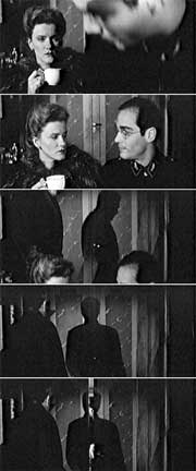
The shot starts asymmetrically until Leopold sits down with Katharina, at which point they form the mirroring sides in a weak symmetry, with the door closing behind them as the axis of symmetry. As soon as the symmetry has been established the camera moves up along the axis of symmetry. Simultaneously, the CEO approaches from the left and stops outside the frame. In the one-tenth of a second before the door opens, the shadow of the CEO falls on the door opening/axis of symmetry in perfect symmetry. However, the doors are opened, and the shadow of the CEO and the symmetry completely disappear. The frail condition of the CEO is indicated in this shot - he is now so weak that he cannot function as the axis in a symmetrical composition. Only his shadow can do so, but it is dissolved immediately. He commits suicide shortly thereafter. Even if symmetries are often broken in film to indicate a lack of power or balance, it is rare to see compositions that predict the events of the narrative and thereby provide the attentive spectator with an extra experience. d) Planning Because symmetry is a distinctive form of composition that draws attention to itself, the absence of symmetry helps intensify the visual effect and thus also the viewer's focus of attention when the symmetrical composition is finally applied. The longer the absence of symmetry, the greater an effect can be created. In Ben Hur (William Wyler, 1959) there is a forty-five minute break in the use of symmetry until the cross of Christ is suddenly erected in the picture's axis of symmetry. Be prepared
There are however a few exceptions to this rule. A scene may for example be introduced and concluded with the same shot. Furthermore, the shot may appear several times if it is part of a series of symmetrical shots, but it will function best if there is a change in the visual expression of the symmetrical composition. Thus, it is important to plan symmetrical compositions carefully, and preferably one should film the situation from an asymmetrical angle if the possibility of cutting back to this shot is to remain open. PROPOSED METHOD The above may be considered a proposal for a method by which the registration (in analysis) or planning (in production) of symmetrical foci can help provide insight into the picture composition of a film, a task that might otherwise be impossible. Inasmuch as the above discussion is by no means exhaustive, the guidelines proposed here should be considered as a starter kit for the understanding of symmetry. | |||||||||||||||||||
| |||||||||||||||||||
| |||||||||||||||||||
| |||||||||||||||||||


