Introduction: The Ericsson campaign and ComeAt the end of the year 1998, Ericsson made a sales campaign for mobile telephones. The newspaper ads showed the photo of an elderly couple sitting across from one another at a table in a restaurant (or is it a kitchen?). He puts his hands on the table; she puts her hands on his. Directly on the photo, there are two texts: "Kærlighedens ord dør aldrig" ("Words of love never die.") and "Make yourself heard" (in English). Under the photo there are 14 lines of text, in which the company expounds its ideas about communication, love and age!
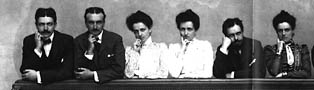
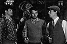
At first sight the similarities between the two are
embarrassing!
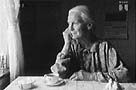
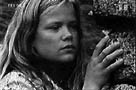
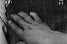
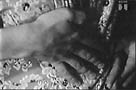
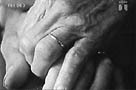
The hand is an index. The hand shows the traces of time and of work. The texture of a hand can tell the experience of a lifetime, even better than the face can do, whereas the face tells us a story of decay. The hand can tell us the story of an action. It is a vector, a means of action, and it gives us access to symbolic processes, to the thoughts of the protagonists. As there is no space for developing this point, I can only recommend that the reader consult Kress and Leuwen p. 43ff. and p. 108ff. The language of the hands in the pictures is a very complex system, a conglomerate of several domains. A cognitive researcher like Paul Messaris would say that we understand the language of the hand in pictures because we draw inferences from our experience of gesture language and other movements of the hand in our everyday life. See Messaris p.14ff. and p.71ff. The pictorial language incorporates at least three domains from "the outside world": firstly the hand of our everyday work, the hand at work and the hand at rest, secondly the gesture language of the hands in everyday life and in more ritual settings (from conversation to prayers) and finally the conventions of the theatre, of ballet, etc. The boundaries between the three domains are by no means clear-cut and some conventions may change quite rapidly such as those in the gestures of the rock singers! The pictorial language has more or less integrated and formalized all these (changing) conventions, at least to some extent. Thus we can establish a scale from "little convention" (realistic or natural photos or paintings of the hand-at-work) to the totally conventionalized emblematic expressions (the praying hand), which Fausing and Larsen call iconographic codes (Fausing and Larsen p.67ff.), and, in between, we have all the more or less conventionalized expressions, as in Come. Look at the Figures 3 and 4. Women and men do not put their hand under their cheek in the same way when they resting or thinking! At least they did not in the paintings of the 19th Century. Women separate the index finger (and possibly also the middle finger) from the rest of the fingers, whereas men keep the fingers together, possibly bending them. It is (or was it?) far from elegant for a woman to keep the stretched fingers together under her cheek, or even worse, bent them, as men do.
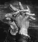
What makes this art and not mere communication is probably the fact that here, as well as anywhere else, the tiny changes or biasing of our expectations revive the expression. Folded hands are a convention for prayer, for meditation (depending on the context). The folded hands as convention demand a symmetric construction.
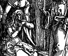
Look at Figures 5 and 6. The asymmetric construction opens up for other, deviant interpretations, here probably sorrow and despair. In Figure 7, Mary Magdalene does not keep her fingers folded and she holds up her hands. This particular combination is a sign of revolt, of protest.
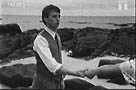
Language has disappeared from Come with the exception of the two imperatives, both collecting and accumulating all the "information" presented by the picture story. The film must necessarily tell the story by means of pictures; no words could lead to the concentrated sense of the imperative "Come." The pictures should not be ambiguous. They should be clear, but not unequivocal. This necessity for minimalist simplicity implies that the camera cannot draw attention to itself as a storyteller by using impressive movements. Of course there are some isolated camera movements: a zoom-in shot, a pan and a tilt, but in fact, most of the shots are rather static, or show a very simple action, which is often completed within the shot. The film concentrates on the faces (their expression, the gaze of the eyes and, linked to this, the p.o.v. camera and the subjective camera). The meaning, and to some degree, the actions are created between the shots, in the montage.
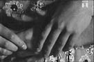
The hand is the decisive factor. The movements of the hand form the actions, or
better still, form the synecdoches for the complexity of the story and the hand
(possibly better than the facial expressions) shows a long life's experience
through its different textures.
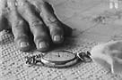
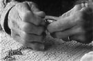
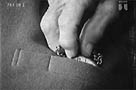
Shot 6: The old hand with its traces of work and rheumatism, the shot accumulates the signs of time Shot 10: The hands of desire, but seen at a distance: the hands have no texture and thus present a secondary story, the mirror for what is told in the following shots .
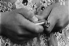
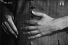
Shot 11: We should now be able to identify the hand as the hand from shots 3 and 6. It is a young hand. It does not have the texture of age, but it has the texture of work. It is rather dirty! It is a hand which has already become acquainted with work. It has no false elegance. Shots 14 - 46: The seduction is told by the use of the gaze (the persons' thoughts, intentions, feelings), whereas the actions are mostly told by the hands shown in close-ups (synecdoches). In shots 16, 17 and 24, her hands are active, holding the watch and showing it. His hands are helpless, seeking the watch in shot 27, and in shot 30 he closes his hand in a powerless way. Her hands become more active. They put the watch back in his pocket (shot 32) and she takes his hand (shot 34). In 39 and 40 her hands begin the final seduction: in 41 and 43 their hands clutch each other and thus the contract is made. They are engaged. His hands can take over in shots 44 - 46.
Last shots: We return to Now: shot 48 corresponds to 16, shot 49
to 32, shot 51 to 41 and 43. Of course her second "come" is the important
thing, but the imperative would make no sense at all, if the hands had
not built up the meaning, if the correspondences had not established the time,
and finally confirmed the old contract.
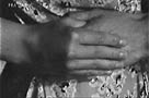
The Ericsson campaign may be considered as a counter illustration. She grasps both his hands. The visual information is ambiguous: does she ask for help, or does she want to dominate him, or what is the situation? The text does not help us. The advertisement says, "Words of love never die", but the sense of these words is killed by "Make yourself heard" and from the 14 lines below the photo, the message is all about a product. The photo becomes sentimental and untrustworthy, which is a shame, because it's a nice photo. Come escapes the Scylla of sentimentality (overloading with information and feeling) and the Charybdis of a simplicity, which does not tell anything or is too unambiguous. This is achieved by the use of synecdochic pictures, and maybe by a tiny dose of empathetic irony. The blend of age-old picture schemes with an impossible fabula (everlasting love) is a masterpiece of refreshing novelty.
Bent Fausing og Peter Larsen. Billeder analyse og historie. Dansklærerforeningen/Skov, 1982. Kress, Gunther and van Leuwen, Theo. Reading Images. London: Routledge 1996. Messaris, Paul. Visual "Literacy". Boulder, San Francisco, Oxford: Westview, 1994.
|