Introduction This article consists of three sections, focusing respectively on:
I also want to thank Lorraine Smit at Fresh Water Films in South Africa and Andy Macauly at ZiG Inc. in Canada for permission to use texts and images from two other important ads cited in this article. I. THE AD ITSELF1. The Original Storyboard for Oh Harold
2. A Shot Breakdown of Oh Harold (Post-Production)
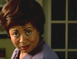
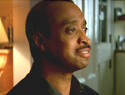
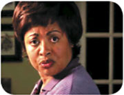
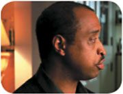
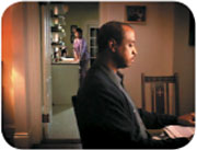
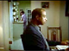
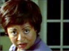
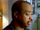
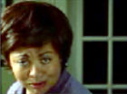
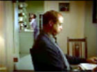
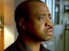
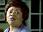
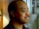
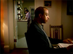
II. FIVE QUALITIES OF OH HAROLDNB. All quotes from Dr. Demetrius M. Parker, Tim Stapleton, David Wild, Michael Trim, Rhonnie Washington and Anasa Briggs-Graves, are excerpts from the interviews found in Section III of this article. CAEC = Cancer Awareness and Education Campaign; DHR = Department of Human Resources; FME = Fletcher Martin Ewing, the agency that developed Oh Harold. 1. The richness of the storytelling But as the spot gets under way, that message becomes a part of a larger narrative, depicting a playful tug-of-war between a husband and wife - the wife trying to force her mate to acknowledge that his concern is actually a declaration of love for her, and the husband teasingly withholding any such admission. Each spouse believes that he or she has gotten the better of the other, the wife having had the last word in interpreting Harold's concern for the plants as an indirect "I love you" addressed to her, and the husband smiling his "got cha" smile at the end of shot 9 (see Rhonnie Washington's comments below), which also brings a perfect closure to the story. The playfulness of this interaction draws the viewer into a story that has the feel of a beautifully written and produced sit-com with a life of its own, despite its diminutive duration, thereby circumventing the various distancing mechanisms viewers often experience when they know they are watching a public service announcement. In this respect, Oh Harold serves as an effective vehicle for delivering its message, embedded in and remaining at the center of a pleasurable narrative. Another way to describe this quality is to suggest that the message focus - to make an appointment for a mammogram - is an essential element in a far more comprehensive narrative, the focus of which is on a loving and affectionately teasing relationship between a husband and wife. In other words, the story focus of the ad contains but goes well beyond the message focus, which is why we experience a richness in the ad. Furthermore the power and vitality embodied by the woman in the spot makes it particularly easy for the female viewer to identify with her, just as the cool and mildly teasing manner of the concerned husband enables the male viewer to identify with him. And these positive images and feelings become linked to the central message of the spot, so that phoning the number appearing in the final title becomes a kind of consequence of liking the people in the ad and enjoying the way they interact with one another. 2. The uplifting spirit of the ad The playfulness of the interaction between Harold and his wife has already been described above, and I would now like to contrast the lighthearted teasing of Oh Harold with a very different approach represented by another excellent TV spot, in order to set the issue of positive versus negative images in even sharper relief. This other spot, which promotes self-examination, [2] was commissioned by the Cancer Society of South Africa (CANSA) and is entitled Pairs. The ad consists of twelve tableaux, in each of which one half of a pair of something is missing. We see successively an 8 mm projector missing its take-up reel; a barbell with the circular lead disks absent from one end; a teddy bear with only one eye; a pair of scissors with one of the handles broken off; a twin cherry stem, with only one cherry; a pair of sunglasses lacking one lens; a double-breasted suit missing a button on one side; a salt-and-pepper stand with only one shaker in place; a home-made walkie-talkie, consisting of a string attached to only one tin can; a car with one headlight out. The end text begins: "Some things belong in pairs" and continues with: "Examine your breasts regularly," followed by the end slate bearing the logo and web address of the Cancer Association of South Africa.
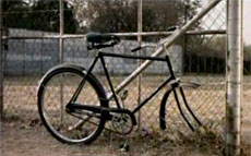
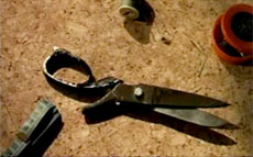
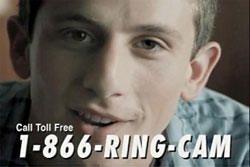
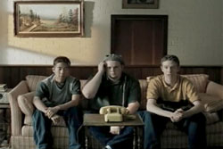
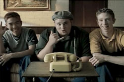
What these tableaux indirectly evoke of course, once the end slate urges regular self-examination, is the asymmetry of a woman's chest when one breast has been removed. And the very tact and indirectness of the ad, which never shows an anatomical image that might be painful to see, is undoubtedly one of its particular strengths. In this respect, it makes its powerful point as gently as possible, and avoids the usual danger incurred by the use of negative images: namely setting off resistances to the message by frightening the viewer. In this particular case however, a very different risk may be in play, since the ad might be understood by some viewers to suggest that a woman who has lost a breast is like a bicycle with a wheel missing or a pair of scissors with a broken handle - in other words, defective. Though certainly unintended, this potential by-product of the ad could well be a kind of discordant resonance within the feelings produced in the viewer by an otherwise beautifully designed and executed television spot. In using only positive images, Oh Harold steers clear of both the main and possible collateral risks involved when negative images are used as points of leverage. 3. The woman as player One ad, for example, shows a woman wearing a low-cut dress and going about her daily routines in the proximity of men in various situations, with the men gazing longingly at her breasts. She takes no notice of this and in voice-over we hear a man say: "If only women examined their breasts as often as men do." [3] In another prize-winning ad, an obliging young man named Cam offers to examine women's breasts for free: Cam (speaking to the camera): Are you too busy to do a monthly breast self-exam? Not sure of the right technique? My name's Cam. I'd like to help. Let me examine your breasts for you - absolutely free. I'm highly trained and highly motivated. So call the number on the screen. ("Call toll free. 1-866-Ring-Cam" flashes at the bottom of the screen.) Call-takers are standing by. (Three teenage boys are shown sitting on a sofa, looking awkward and not knowing what to do with their hands. Return to Cam on screen. ) So put your breasts in my hands. Let Cam do your breast exam. (Now on a black screen, the words "They're your breasts" appear in white script, followed a moment later by "You do it." Again the three teenage boys are shown perched on a sofa, now grinning, waving or making a "phone-me" gesture. The end slate then appears with the tagline, "Examine yourself monthly" and the logo of the Breast Cancer Society of Canada.)
Here, humor is a means for capturing the attention of the viewer, who is afforded the pleasure of seeing through a delightfully transparent and outrageous ploy. And the humor also serves to preclude or neutralize anxiety that might otherwise be raised by the issue of breast cancer. [4] The ad is brilliantly written and produced in every respect, with just the right degree of smoothness in the Cam character, in contrast to the fumbling and cruder eagerness of the three buddies on the sofa. In focusing on the breast-fixation of immature men, this ad playfully harnesses for a noble cause an alienated mode of male sexuality that divorces the breast from the person and is essentially opportunistic. And the joke of course is on Cam and his buddies, for mistakenly thinking they are putting one over on a gullible female viewer. In Oh Harold, an equally interesting game is in play, but it is one in which the woman is a key player, not only through the things she says when reframing her husband's remarks, but also in her manner and very presence on screen (thanks largely to Anasa Briggs-Graves's brilliant interpretation of her role). And although her husband (superbly played by Rhonnie Washington) withholds any explicit expression of his love for her and thinks he has won the verbal tug-of-war, she comes across in this dialogue as a strong, self-empowering woman, and a formidable player in any game in which she might be involved. Offering this image of womanhood to the female viewer is surely a storytelling asset of Oh Harold. 4. Combining cultural specificity with universal appeal Many ads in the United States, including health-focused ads, feature only Anglo Americans. Our studies revealed that African Americans desired ads that included them. We stressed with FME cultural diversity of message and image for the CAEC. This of course was a key consideration in casting the superb African American actors Anasa Briggs-Graves and Rhonnie Washington in the two roles, However, the script by Tim Stapleton was inspired by his Anglo-Saxon family background in that the dialogue was Loosely based on the way all of the uncles on my mother's side of the family would talk to their wives. Very sarcastic, never giving them credit for anything. But you could always tell behind all of that caustic humor that they were genuinely in love. The cultural factors in this situation became even more interesting when Anasa Briggs-Graves read her part. As she put it, she and Rhonnie Washington "were encouraged to embrace the dynamics that exist between mature men and women in our culture," and this accounts for her giving a special twist to her performance. As Tim Stapleton stated: In my head the script didn't read the way she performed it, she did that on her own. I originally had it in mind for the woman to be very sweet and happy that her husband was trying to tell her that he loved her. Suddenly this very strong Black woman turned it completely around and very forcefully told him that he was, in fact, telling her that he loved her. It was a terrific moment during casting and had us all on the floor. They were both sensational. What happened here was that lines written Anglo-Saxon were delivered in an authentically African-American manner, with the result that people in the primary target group could experience the spot as tailor made for them, while members of other cultural groups could recognize themselves in the ad as well. Again, in Tim Stapleton's words: This situation was based on my family, which is Anglo-Saxon, but since it is an honest portrayal of human emotion, it appeals to any race or religion. This would've been a very funny execution with a Jewish couple. (I actually wanted the Cartoon Network to do a version with Fred and Wilma Flintstone using the same script, but they wouldn't allow it. Dr. Parker also agreed that FME "captured elements of human nature that are recognizable by all cultures and ethnic groups with the Oh Harold ad," which he further considered to be free of the stereotypic images often found in other ads "that include non-Anglo actors." Communicating in a way that is experienced by audiences as genuinely culturally specific and universal may be a widespread ambition in the advertising industry, but few TV spots bring that combination off as successfully as Oh Harold. 5. A non-didactic approach III. THE MAKING OF OH HAROLD1. An interview with Dr. Demetrius M. Parker[5]
I understand that you commissioned the production of the Oh Harold ad on behalf of the DHR. Can you tell me in your own words what you see as the special qualities of this TV spot, in relation to the guidelines you gave to the ad agency, Fletcher Martin Ewing (FME)?
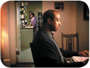
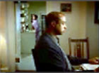
Is there anything else you can tell me about the arrangement you made with FME? One of the strategies we included in our contract with FME was that they use their clout and professional network to leverage the CAEC budget dollars. FME excelled at this charge. The agency was able to coordinate work they were doing on a separate account with the work they were doing for DHR. They developed the Oh Harold ad without incurring the traditional costs for producing a first quality television advertisement and passed the savings on to DHR. 4 January 2005 2. An interview with Tim Stapleton Did the Georgia Cancer Coalition give you any storytelling guidelines when you were asked to develop a concept for this ad? Can you tell me anything about how the idea for this ad came to you? This is a bit of a long story, and no, I didn't receive any guidelines when it came to storytelling. We really weren't even asked to do commercials, since we didn't have money to produce them. Instead, we thought we could find some cancer spots that had been produced by other states and put our own tag at the end. After searching through hundreds of commercials, I didn't see anything that I really liked, so I thought that we should just create little thirty-second audio stories and punctuate them with camera cards. That treatment would cost about as much as it would to retag an existing commercial and we could say exactly what we wanted to. The first spot I did featured a little boy asking his grandmother to get a pap test. I wrote Oh Harold and intended to produce it in the same manner. But at the same time I was preparing to shoot a new campaign for Piccadilly restaurants and the director, David Wild, asked me what else I was working on. So I told about the Oh Harold spot. He said, "Oh, you've got to put that on film." And I said, "I can't, I don't have any money." And he said, "Oh, you've got to put that on film." And I said, "I don't have any money." And he said, "Oh, you've got to let me shoot that." And I said, "Ok, but no money means no money." The reason I insisted on telling David I had no money is because almost every director I've ever shot with has offered to shoot something for free. But in every instance, in almost twenty years of doing this, I've run into a wall called the executive producer. This is the person who is responsible for how money is spent on a shoot and they usually want you to pay for the hard costs of things like camera rental and film stock. David is the first director I've worked with who's ever actually done it all for free. He asked everyone to go on overtime after we wrapped the Piccadilly shoot. He asked the casting director to cast Harold and his wife. He asked the location scout to find a setting that was suitable for Oh Harold and the Piccadilly spot. If I had just bid the commercial with David and not asked for a freebie, it would have cost $188,000. That also goes for Chris Taylor, the editor, who did all of the post work. They did it all for free. When you consider how many people are involved in such a production, it's an amazing gesture. But long before all of this, I should tell you how our strategy came about. We went into focus groups armed with about 25 positioning statements, most of which asked people to get checked for cancer. The groups were an absolute disaster. What we found out was that our target absolutely did not want to be told to get checked for cancer. And they especially didn't want that message coming from the government. It was very depressing. But then we noticed some interesting little conversations that people were having in the room before the moderator came in. All they could talk about was a beautiful son, or a wonderful nephew, or a granddaughter who was the light of their life. It dawned on us that for this segment of the population, down to a person, the most important thing in their life was their family. Well, if we weren't going to get permission to tell these people to get checked for cancer then we were going to enlist people who didn't need permission: the family and loved ones of the people we were trying to reach. So we shifted the focus of the campaign a little so that we never ask anyone directly to get checked, but we show entertaining ways in which a friend or family member talks to a loved one about cancer. By taking ourselves out of the equation and empowering others to deliver our message for us, we raised the number of calls to the center by 800%, including increases in every zip code in Georgia. So, in answer to your question, all I did was think of an entertaining way a man could tell his wife to get a mammogram. I don't even mention the "C" word in the spot. Oh Harold is loosely based on the way all of the uncles on my mother's side of the family would talk to their wives. They were always very sarcastic, and wouldn't give their wives credit for much of anything. But you could tell behind all of that caustic humor that they were genuinely in love. It was a strange thing, but very honest. When I presented Oh Harold to one of the clients, she just kept shaking her head laughing and saying, "Oh no! Oh no! NO. NO. NO." I thought she was killing the spot, but she really loved it and thought it was hysterical. I think everyone knows someone or is related to a couple that communicates the way the couple in the commercial do. The issue of getting a mammogram is a key factor in the story, explicitly from the very start. Yet the dramatic center of the story lies in the relationship between the husband and wife. Do you see the ad that way? And would you agree that the story's dramatic center is to some degree independent of the service the ad promotes and that this is one of the qualities that make this such a satisfying experience for the viewer and such a successful motivating strategy with respect to cancer awareness? Yes. You're exactly right. I never really analyze my work this much, but your logic is correct. It's simply a man telling his wife he loves her in his own way. Whenever I write a commercial, I try to make the story impossible to tell without the product I'm trying to sell. I know that sounds elementary, but you'd be surprised how many people don't do it. In this case the product is the mammogram, so it was very easy to make it central to the dialogue. But the story we're telling is really about the relationship of the couple. I think what's satisfying about the spot for the viewer is that it's a situation that everyone can relate to. Was the casting of Black actors (whose performance is superb, in my opinion) a part of the concept from the start? Was this related to the target groups the ad was designed to reach or the result of any other considerations? Yes it was. I always saw it as a Black couple because that was the largest segment of our target audience. But I've always included all races in my casting sessions because I don't want to miss out on the performance of a gifted actor. But it's an interesting topic to me and underscores something I've always believed. This situation was based on my family, which is Anglo-Saxon, but since it is an honest portrayal of human emotion, it appeals to any race or religion. This would've been a very funny execution with a Jewish couple. (I actually wanted the Cartoon Network to do a version with Fred and Wilma Flintstone using the same script, but they wouldn't allow it.) Something else that I think made it very genuine was the performance of the wife. In my head the script didn't read the way she performed it, she did that on her own. I originally had it in mind for the woman to be very sweet and happy that her husband was trying to tell her that he loved her. Suddenly this very strong Black woman turned it completely around and very forcefully told him that he was, in fact, telling her that he loved her. It was a terrific moment during casting and had us all on the floor. They were both sensational. This ad differs considerably from other breast cancer awareness ads. How would you characterize what sets it apart? The thing that I found to be refreshing about this whole campaign is the fact that we never tell anyone to get checked for cancer. We don't even mention cancer in most of the executions. I didn't see this approach in any of the hundreds of spots I looked at. They all said things like, "imagine how hard it will be for your family when you're gone." Or, "If not for yourself, get checked for them." And they all seemed like tired executions, which were easily ignored. There was nothing out there that said "make sure your wife gets a mammogram." It was an exciting road to explore. 8 December 2004 3. An interview with David Wild Were you involved in the development of the concept for the ad, or was that already pretty much worked out by Tim Stapleton when you got the assignment to direct the film? It was pretty much worked out by Tim by the time I was involved - although Tim does allow a lot of flexibility once I start. The issue of getting a mammogram is a key factor in the story, explicitly and from the very start. Yet the dramatic center of the story lies in the relationship between the husband and wife. Do you see the ad that way? And would you agree that the story's dramatic center is to some degree independent of the service the ad promotes and that this is one of the qualities that makes this such a satisfying experience for the viewer and such a successful motivating strategy with respect to cancer awareness? I see the ad the way you've described it. It's kind of funny to see it analyzed like that. To me it's a healthy couple with a good sense of humor. The husband's poking a bit of fun in his wife's direction. He might not come right out and say he loves her - but he definitely knows what he's doing. I think it's kind of close to real life - at least to my experience. The dramatic center is independent of the service the ad promotes. I think that's what makes it successful. People don't talk that much about mammograms. And to have a bit of fun with the cancer detection - "who'll water the plants?" - I'd never seen a script like this before. One of the hardest things about directing commercials is getting great scripts. It's really not that often that a great script or concept comes through the fax machine, and when they do, it really makes you want to do it. Was the casting of Black actors (whose performance is superb, in my opinion) a part of the concept from the start? Was this related to the target groups the ad was designed to reach or the result of any other considerations? The actors were superb. We knew it when we saw them in casting. The actress actually added that little bit of wiggle. We just cracked up when we saw it in the session. They were both professionals and really fun to work with. They got it. I love the husband's little smile at the end. As far as I know, Tim wanted African-Americans because they were the audience that we wanted to attract. Evidently in the U.S., many African-Americans are reluctant to go to the doctor. Tim can probably talk more about that - he's heard the research. In my case it didn't make a difference. These actors were great. And I'd rather see more minorities treated with respect and like the real people that they are. Sometimes in the U.S. the advertisers tend to go a little overboard - but that's a whole other topic... Is there anything else you can tell me about the making of the ad - the way you directed the actors, the design of the setting, the shoot? We were able to get a lot of range out of the actors (there's that professional thing) so that the performance could really be fine tuned in the edit. I really liked Tim's addition of the Debussy piano track. One of the things that I am proudest of is a suggestion that came from the director of photography, Mike Trim. He suggested that we frame in such a way to keep the actors back to back - on the opposite side of the frame as you would normally have them - even with the negative space in the singles. You know from screen direction that people are usually talking face to face from cut to cut. Not that this was a radical suggestion, but it's something nice for the film students. What appealed to me in Mike's suggestion for the 'back-to-back' framing was that it helped to physically illustrate a part of the couple's relationship. This was minimized a little in the final telecine - but it looks great in the first wide shot. Since the whole crew had volunteered to stay late and shoot this I wanted them to have as much creative freedom as well. And Mike had a great suggestion.
9 December 2004 4. An interview with Michael Trim One of the things both David Wild and Tim Stapleton mentioned was your idea about framing the husband and wife back-to-back. Can you tell me how that idea occurred to you and why you felt it was appropriate in this particular case? I had actually forgotten about the framing of the couple back to back. I remember that after watching a rehearsal of the actors doing the scene, it occurred to me that these were two people who were very comfortable with each other. Being married myself, I know that you don't have to be looking at your wife to be speaking to her and it felt very natural to have them not face one another. It seemed much less "stagy" if you know what I mean. I thought the idea of them being so comfortable with each other would reinforce the idea of their love for one another while at the same time not bashing you over the head with it. And I was fortunate enough to be working with Mr. David Wild, one of my favorite directors to work with. He is always open to an idea or thought about what we are shooting. And Tim Stapleton is a joy to work with from an agency and a personal standpoint. Would you agree that Oh Harold stands out from many other breast-cancer awareness spots? I don't think I've seen many other breast cancer spots, and if I have none stand out. This particular spot is appealing to me because of the undercurrent of warmth and the affection displayed by the couple without being schmaltzy. It's just about two people caring for one another. Is there anything else you would care to add about Oh Harold ? I can't think of much else to say. It's always a pleasure to work on something that isn't trying to sell some useless thing to people who don't need it. This commercial had a purpose and hopefully it connected with a few people and made them more aware of breast cancer and the importance of being tested. Also, I had forgotten that this was a spot that we shot after a regular day of shooting another commercial. I have been asked many times to shoot something for nothing for a director and usually it is some spot for their reel, something they consider special that will get them more work. I don't think any of us thought that way about this spot. We all felt as if we were doing something worthwhile with our time. 31 December 2004 5. An interview with Rhonnie Washington Can you tell me how you understand the interaction between your character and the character of the wife, in this story? I think that this is one of the ways that Harold expresses his love for his wife. She thinks it is really sweet that he was concerned enough to mention the mammogram. While sweetness is not beyond Harold, it is not one of his primary characteristics, at least not one he seeks to cultivate or to exhibit often. He doesn't want her to interpret this "sweetness" as a change of heart. If she got that impression, then she might even expect him to say the "L" word. Checks and balances must remain in place. "If you give a woman an inch, she'll think she's a ruler." Your smile just before the end of the spot is a great moment. I know that the director also loves that moment. Is there anything you can tell me about that smile during the shoot? To me, the smile says, "Got cha!" She is clearly pressing for some kind of declaration of love, "You love me, you can't live without me." Harold deftly sidesteps declaring his love for his wife by offering an alternative point of view. He offers her something to think about that is so powerful that it almost shuts her mouth. Perhaps, his concern was not any more for her than it was for the plants. Technically, Harold wins, but actually they both win. They use this game that they play to momentarily bask in each other's affection. This is an extraordinary TV spot. Can you tell me what you think sets it apart from so many others? For me, the writing sets this spot apart. I know that I identified with Harold immediately. I thought that I knew him. His relationship with his wife reminds me of my relationship with my father. I'm not sure that he ever told me that he loved me. I knew that he did, but stuff like that was hard for him to say. I think he figured, "Talk is cheap." If your love is not manifested in any way other than talk, then what good is it? Is there anything else you would care to tell me about the shoot or any other aspect of "Oh Harold"? I liked the way the writer cultivated the duality of Harold. We get to see his cool exterior as well as his warm, creamy center. And, maybe I like the spot for the same reason that I like The Lion in Winter . Henry never professes his love for Eleanor, nor Eleanor for Henry. However, they are clearly desperately in love with each other. Do they love each other more than power? Perhaps, that is the major dramatic question? 17 December 2004 6. Comments from Anasa Briggs-Graves Most marriages survive if there is a playful tension between husband and wife. I saw "Harold" as a character who was dry and if opposites attract... Tim [Stapleton] and David [Wild] created a vehicle that is authentic, has texture, utilizes a realistic environment, an important message and rich production design. My fellow actor/'husband' and I both are married. Additionally we have extensive theatrical backgrounds. Finally, we were encouraged to embrace the dynamics that exist between mature men and women in our culture. 27 December 2004 Concluding note In my own discussion of five specific qualities of Oh Harold, particularly in comparison with other excellent PSAs, I have tried to point out some of the special storytelling assets of Oh Harold. This study will be one of a number in a forthcoming book devoted to the art of the public service announcement - a format with extraordinary challenges and possibilities, and that deserves closer attention as a form of cinematic storytelling than it has received to date. | ||||||||||||||||||||||||||||||||||||||||||||||||||||||||||||||||||||||||||||||||||||||||||||||||||||||||||||||||||||||||
| ||||||||||||||||||||||||||||||||||||||||||||||||||||||||||||||||||||||||||||||||||||||||||||||||||||||||||||||||||||||||
| ||||||||||||||||||||||||||||||||||||||||||||||||||||||||||||||||||||||||||||||||||||||||||||||||||||||||||||||||||||||||
