|
Eugene Smith and Joachim Ladefoged.
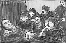
The composition is triangular, with the dead person's head forming the left angle, the two other angles being placed in the upper and lower right corners of the photograph. The light, a classic use of chiaroscuro, comes from above, and models all the faces except that of the woman in the upper right corner. The five other women form a very solid group, a geometric 3D shape. Four of them are completely lost in their thoughts; their eyes look at nothing, even though their faces are turned in the direction of the dead. But the fifth, a girl placed in the middle, looks gravely at the dead, thus stressing the movement from the right to the left. The scene is depicted with graphic simplicity; the emotional impact is enormous. It is a modern replica of all the paintings showing the women and St. John mourning Christ, the lamentation motive. In 1998, the Danish photographer Joachim Ladefoged won all three prizes for singles in the World Press Photo contest category People in the News, as well as the first prize for stories in the same category. This picture similarly shows some women mourning a dead person, but there is no clear composition. There are ten mourners and they do not form a whole; they are looking in different directions. The light is a daylight that does not model the faces or the bodies, which remain flat. Ladefoged's contact-copies show (and he has told the story himself) that a person was coming in from the left and that Ladefoged continued to take photos until the person came into the picture, forming a repoussoir in the left margin of the photo. It is obvious that this person saved the photo from being incoherent and unbalanced. Nevertheless, from a compositional point of view, there is a gap between the Danish photo and the 46-year older American version of the lamentation theme. In the following year, 1999, Canadian Roger Lemoyne won the second prize in People in the News, stories: now the dead person is from Kosovo, and there are fourteen mourners around the coffin. Each person has an expressive face, but the dead person is seen from an impossible angle, his face being foreshortened in a way which lends it a wicked expression. Only the Italian Renaissance painter Andrea Mantegna has ever been able to use this angle in an appropriate way, and only Smith could use light and geometry to give the impression of eternal rest! American Traditions Smith was a man of principle, artistic as well as social. He began his carrier during the epoch of the Farm Security Administration, which produced some 270,000 clichés, some of which have become icons.[1] The Farm Security Administration achieved, in fact, as much for the recognition of photography as an art as did Stieglitz by publishing "Camera Work" from 1903 to 1917. The FSA photographers definitely differed greatly, but they had social engagement and an artistic use of photography in common. Does this mean that the American press or documentary photo could be characterized by this combination of artistic value and social engagement? Is this too idealistic? Methodological Problems The structures of the press. How do the structures of the printed media in the USA and in the different European countries compare? What are the importance and the functions of the press in the USA and in the different European countries? Are there differences between national and local press? Do all countries have a national press (take, for example, Germany and the USA!)? What is the relative importance of quality newspapers and popular newspapers in the USA and in the different European countries? What is the importance of all these questions for the functions and the aesthetics of press photography? The problems of representativeness and the evaluation of qualities. The problems are overwhelming. Should we compare a representative number of newspapers of different types on the basis of their quantitative and qualitative use of photos? How should we define qualities to compare? Can one measure or count aesthetic qualities at all? Can one measure or count communicative qualities? Unfortunately, there are greater differences in photo policy and photo aesthetics between, say, a French local newspaper like Le Dauphiné Libéré and the Parisian Libération than between Libération and Washington Post. When talking about the role of the FSA, I was obviously referring to one of the highlights of the world’s history of photography. A true comparison of USA and Europe, however, is not to be seen in highlights, but is concerned with the everyday use of photos, even in humble commercial and local papers. But who ever looks at a local paper from Cleveland, Pittsburg, Toulouse, Nizhni Novgorod, Florence or Tampere? The moral of all this, of course, is that this hypothetical comparison of European and American photography implies the use of large scale qualitative as well as quantitative investigations and a historical survey covering all the different European countries. And this is impossible! Nevertheless the questions raised by the contemplation of Smith and Ladefoged's two photos may provide an answer, however provisional and tentative, if one looks at the photos of the World Press Photo contest. The World Press Photo Alternatively, are there specific national themes that can only be depicted by representatives from the particular nation? Can only Americans make good photos of a gay rodeo (WPP 1998)? Is the decay of Italian aristocracy (this Welt von Gestern) only a matter for Italian photographers (WPP 1998)? But political events in a given country must necessarily be covered by photographers from foreign countries. This is fundamental to press photography, involving the risk of photographers becoming tourists in horrors and social problems, especially when they go to the third world, where they sometimes seem to see nothing more than they already knew before going there. I have evaluated a small number of aesthetic and communicative qualities in the 1998 – 2001 catalogues of World Press Photo by asking some simple questions:
Geometry – Disorder The American photographers of the WPP seem in many respects to follow Eugene Smith. Their photos are constructed according to a kind of geometric principle or visual pattern that assures the coherence of the photo. This organizing principle enables the creation of elements in the picture that can function as metonymies (see next section). American Press photography follows a path that was established long before Smith and the FSA by Goya in his Disastres dela Guerra, etchings showing the French soldiers' atrocities during Napoleon's occupation of Spain in the beginning of the 19th century. We see the same horrors as shown in press photos from the Balkan, the Caucasus or Afghanistan. Here are a few examples from the four collections of pictures. Wendy Sue Lamm's picture of the clash between Israeli soldiers and Palestinians took first prize in the category Spot News, singles, in 1998. The photo is divided by a pillar in the middle, both halves form a triangular shape. You see three Israeli soldiers forming a group that shows the phases of stopped movement: the one to the left is leaning forward, the one in the middle has stopped and the one to the right is leaning back. The left-to-right movement stressed by the direction of the Israeli guns is stopped not only by the soldier leaning back, but also by the beginning Palestinian attack, coming as a movement from the right. Both groups are inscribed in a triangular shape; both shapes express movement, but in different ways. The same year, Judah Passow got the second prize for People in the News, singles and stories (using almost the same theme as Sue Lamm), by showing the same tendency to concentrate a maximum of meaning into a simple geometric shape. Where Wendy Sue Lamm uses metonymy, however, Judah Passow drifts towards a metaphorical use of the photos. In 2001 the first prize in the category Sports, singles was won by two Americans, Bill Frakes and David Callow, who show Marion Jones winning the 100-meter sprint at the Sydney Olympics. It is the most extraordinary photo in the four years from 1998-2001. The illusion of movement, the coherence, and the speed of the group of pursuers, with the winner stopping her motion after the victory, exhibit every imaginable device that can be used by picture makers to create the illusion of movement. Let us take a look at European photographers. The Danes, who for the last four years have won many prizes, even first prizes, normally display little sense of geometric shape and coherence. Nor do they show the same sense of isotopy (redundancy from picture to picture) displayed in the stories of the Americans. The best examples of this coherence are the first and third prizes in the category of Spot News, Stories 2000. Only the Russians seem to be able to compete with the Americans in their sense of unity in each picture and in their sense of giving a specific tonality to the stories (visual isotopy) from picture to picture. The Russians (the winners!) use a restricted scale of colors: brown, gray, and olive. They use texture in a way that suggests that men (soldiers), tanks, and mud are identical (visual isotopy within the individual photo). Especially Kozyrev (first prize for General News, singles and third prize for General News, stories 2000) knows how to inscribe complex actions into simple geometric shapes. It may be concluded that photographers from the USA and Russia display an extraordinary sense of construction: geometric coherence and texture creating pictorial unity. Anecdotal sense or meaning produced by construction? Nevertheless, in this specific chapter it is difficult to find a clear distinction between European and American press photos. Take the Portraits 2001, be it either singles or stories. There is no sentimentality whatsoever in these portraits of people, nor would one be able to see that the first prize for singles and the third prize for stories were produced by Americans, whereas the third prize for singles and the first and second prizes for stories were by Europeans! The second prize for singles in the category of Daily Life, shot by Ed Kashi, shows an old woman dying in her bed, while members of her family are sitting around her. They try to comfort the dying woman and her husband. If any scene could be an invitation to sentimentality, this is surely the one. Instead, it is harsh realism. There is no beauty in the dying woman, and no God to receive her soul. This is how we die. The photo is in the FSA tradition, and constructed according to the rhythmic and geometric principles of Eugene Smith! Still, of course, anecdotal, human-interest stories, in fact, ironical ones, do appear! Look at the second prize for Sports, singles, William Frake's photo of the winner of the 100-meter world championship, Maurice Green, sticking his tongue out at his opponent, Donovan Bailey. This is amusing; in a way the photo questions the serious façade of modern sport. Foreseen and Unforeseen: the Ambiguous Message The American press photos of those four years do find new aspects, new combinations of well-known elements. More than the Europeans have done in this respect? Probably. Wendy Sue Lamm's clash between Israeli soldiers and Palestinians is an example of such a new aspect of an old story; it stops the Israeli soldiers in an ambiguous pose; are they aggressors or the objects of aggression? Carol Guzy's third prize in Portrait, singles 1998 (Muhammad Ali) is an intense new interpretation of that living myth as leaving this world and his past through the right bottom corner of the photo! Stanley Greene got the third prize in Portraits, stories for his series on Chechnyan refugees in an Ingushetian asylum for mentally disabled children. It is a terrifying story because of the ambiguity; is this person a refugee turning mentally ill or is he simply ill? The spectator is bewildered; what is the truth of the horrors? How should he or she interpret all this? Using simple procedures and very calm photos (no action) Greene succeeds in destroying our whole conception of what is normal and abnormal. European photographers, of course, can be just as free to see new aspects. Kozyrov's Russian soldiers is an example, and the Frenchman, Thomas Coëx, with his Spot News, story (third prize in 2001) is another. His story about the Palestinians and the Israeli Police is told as the clash between small human individuals (in the foreground of the picture) against impersonal black cars (in the background), and is seen from the Palestinian point of view in the literal sense of the word. The differences in color (black cars versus vivid red-and-green clad young people, the whole on a harmonious, colored background!) create a surrealistic effect. However, the majority of European photo stories show what one expects to see. The Danes are good at doing this. Fuglsig's story (first prize in the category Nature and Environment, stories, 1999), about the nuclear pollution of Muslumovo in Eastern Russia, gives what one would expect, what one knew beforehand: the well-known picture of Russian pollution and general decay, presented in an artistic way. Subsequently, there has been much discussion about Fuglsig's story. Some of his pictures have been slightly re-arranged, and some have been processed (in brightness with specific contrasts) without using electronic devices. All this is forbidden in the photo-journalistic ideology, but that is not the problem. The problem is that Fuglsig adds nothing to what we already knew, and that every arrangement and enhancement in the production of his photos conforms to a pre-established scheme. Conclusion There are some differences between European and American press photography at the level established by the jury, the aesthetic level. The FSA heritage is strong in the pictures selected by the jury, but not every American photographer has this combination of artistic values and social engagement! The differences are mostly to be found as differences in social level. The similarities are to be found within social levels, but … We are back where we began.
| |||
|